Packaging Design News

Packaging Design News

Packaging Design News featuring great design, architecture, fashion, graphics and innovation from across the globe.


Moon and Tea for Mid Autumn

The Mid-Autumn Festival is traditionally celebrated in China in the eighth month of the lunar year. The designers created a unique gift box for Vanke for this year's full-moon festival. It has a distinctly Chinese feel, elegant and beautiful, with a bamboo box body and white porcelain tea plate. The box contains moon cakes with local colored rice and Pu-erh tea. When opened, the body of the box and the porcelain cover become a tea tray; the box doubles as a soft lamp while drinking tea and watching the moon.

Continue reading


Zhuojiu

The inspiration of the wine bottle shape comes from the "axe" that represents power, so use "power" as the design idea to express the spirit of Chinese Liquor Drinking. Therefore, from the perspective of strength, concretized the thoughts and feelings of the image by skillfully integrating " hard" and "soft" into the axe and mountains and trees, so that people can imagine the flavor of this Chinese Liquor when they see this packaging of ethereal beauty at a glance.

Continue reading


Galaxy Trail X

This is the Mid-Autumn Festival food gift box have been designed for clients. Unlike the standard flat iron boxes, designers elevated the top of the metal outer casing by one centimeter, which may result in additional production and transportation cost. Despite the challenges posed by this modification, it is this yearning to break through the plane and reach for the stars that fuel humanity's boundless pursuit of the universe.

Continue reading


Honey

This packaging designed for honey presents one of the most unique ideas for this product. A combination of hexagons placed on top of each other and reminiscent of a beehive. The honey in this package conveys the greatest sense of naturalness and purity to the consumer, as if you are directly taking it from the beehive itself. The very favorable use of glass and wood materials together has helped in strengthening this feeling, and of course, it goes without saying that the final packaging also conveys the feeling of the product's quality to the consumer.

Continue reading


Beidacang Junfei Wine

Based on the design theory of the five senses, the bottle shape is designed with peach blossom makeup, and the bottle cap is shaped like a peach blossom and decorated with ancient hairpins decorated with phoenix hairpins, reflecting the spirit of "junfei". The box is based on the "cross-collar right lapel" of Hanfu as the creative point, creating a visual feast of "Phoenix Crown and Xia Phi". The ingeniously designed handle at the collar is convenient for consumers to carry.

Continue reading


4Paradigm Sage AIOS

They have redefined a new packaging style that reflects the needs of enterprise customers and the characteristics of AI technology while retaining their brand identity. They use the ultimate combination of silver, cyan grey paper symbolizing a tough and reliable enterprise personality, and transparent frosted material that breaks through the traditional dimension and boundaries to explain their perspective on the future, to cater to customers' imagination for AI and deliver a packaging experience befitting an enterprises of the future.

Continue reading


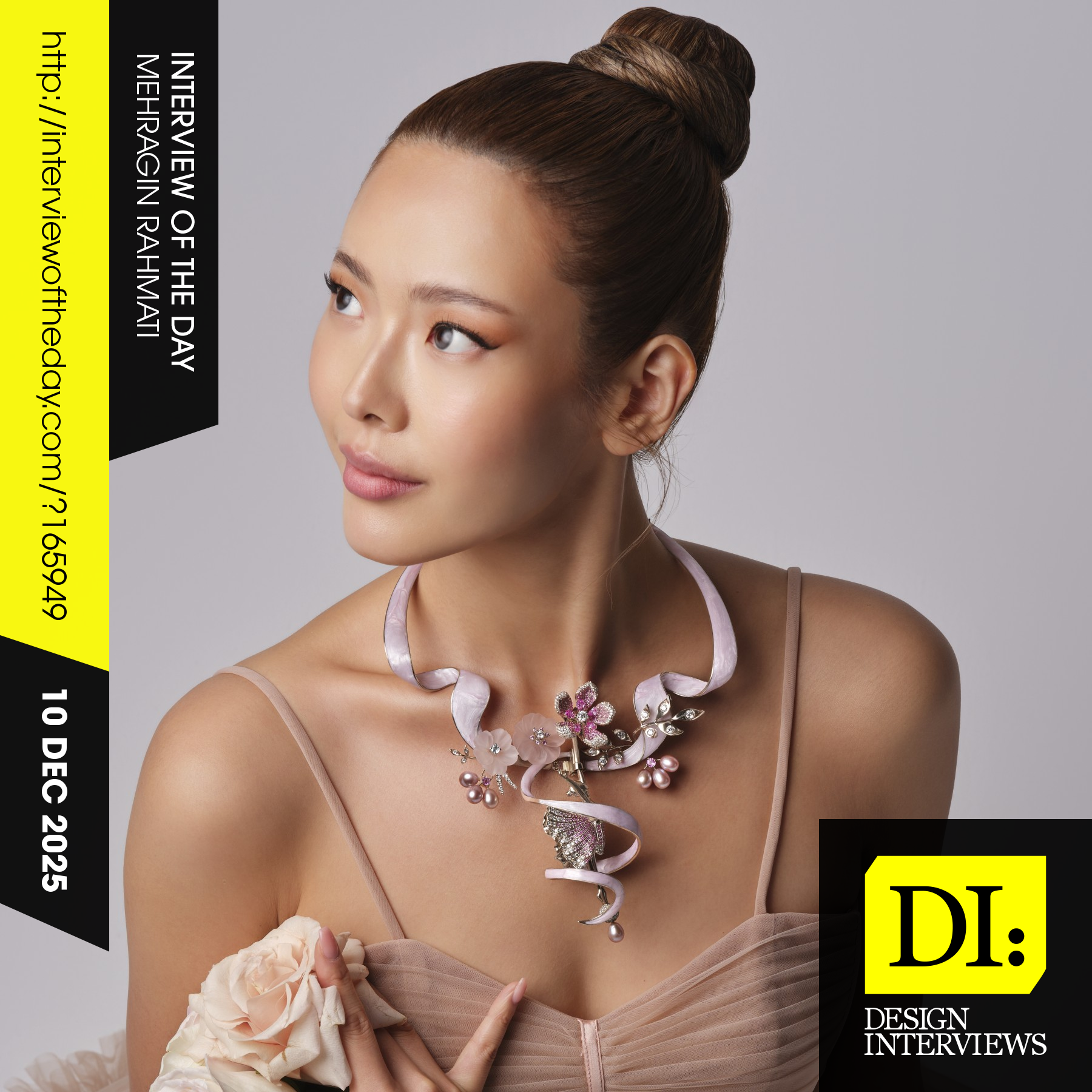
Design interview of the day

Read the latest interviews and conversations on design, creativity and innovation between design journalist and world-famous designers, artists and architects. See latest design projects and award-winning designs by famous designers, artists, architects and innovators. Discover new insights on creativity, innovation, arts, design and architecture. Learn about design processes of great designers.

Continue reading