Packaging Design News

Packaging Design News

Packaging Design News featuring great design, architecture, fashion, graphics and innovation from across the globe.


Jiao Yu Gin

This localised gin packaging gives customers a pleasant and relaxing drinking experience. The main body of the package showcases the aesthetic characteristics of the traditional bamboo weaving culture of the Ba Shu style combined with the modern, sophisticated art style. The bamboo weaving element and raw material labelling also express the brand concept of Natural as Nature. While ensuring an attractive appearance, using bamboo paper and oak cork also rejuvenates environmental sustainability.

Continue reading


Blooming Flowers Seeking

The cosmetic packaging exudes a natural allure, breaking away from the traditional, reserved aesthetic commonly found in the cultural and creative designs inspired by the Palace Museum. It forges a new path by incorporating lively motifs like regal palace cats, butterflies, and peach blossoms from the Palace Museum collections, all enhanced with exquisite textures and a palette that is both simple and elegant. These elements unite to create an artistic realm that resonates with the vibrancy of everyday life. Tailored to appeal to younger groups, this packaging also elevates brand recognition.

Continue reading


Shede Spirit Oriental Wisdom

This spirits gift box stands out with the integration of Weiqi culture and the playability of Weiqi game. The spirits bottles and Weiqi stone bowls mimic black and white Weiqi stones and are placed crisscross, visually conveying the Oriental wisdom flowing in Weiqi, namely an opposite but unified relationship between abnegation and obtainment. This dialectical nexus aligns with the dynamic equilibrium people strive for. As a synthesis of the brand connotation and the spiritual core of Weiqi, this packaging offers a culturally rich and playful experience for users during spirits savoring.

Continue reading


Anti Sun Damage Series for Children

The sunlight shield visual hammer symbol is creatively incorporated into the packaging, which aligns with the brand concept of light damage resistance. The snow mountain series packaging design emphasizes the unity and playfulness of the product, showcasing the aesthetic pursuit and mastery of the designer. Furthermore, the packaging of this series is scientifically designed to improve its usage and interactive experience, promoting innovation and child friendliness.

Continue reading


Challenger

Challenger is a spirits packaging design. Inspired by traditional Chinese mythology Nezha and Wukong. Express the spirit of courage to challenge. The main colors of the bottle are blue and orange with illustrations. The packaging box is dark blue, with elements representing Wukong and Nezha printed on the front, and the craftsmanship is embossed with hot stamping. Integrate illustration art and Chinese culture into packaging. Adopts an oblique 60-degree double-door opening method.

Continue reading


Gota

The packaging of the brand takes inspiration from the Maori tale of New Zealand and blends the vital force of the culture, traditional wisdom, and modern technology, aiming to offer a quality and natural skincare experience. Furthermore, the packaging design is oriented towards sustainability, employing recyclable and environmentally friendly paper and printing materials, thereby avoiding using metal materials and electroplating processes that do not align with modern society pursuit of environmental protection.

Continue reading


Amazing design. Good design. Best design.

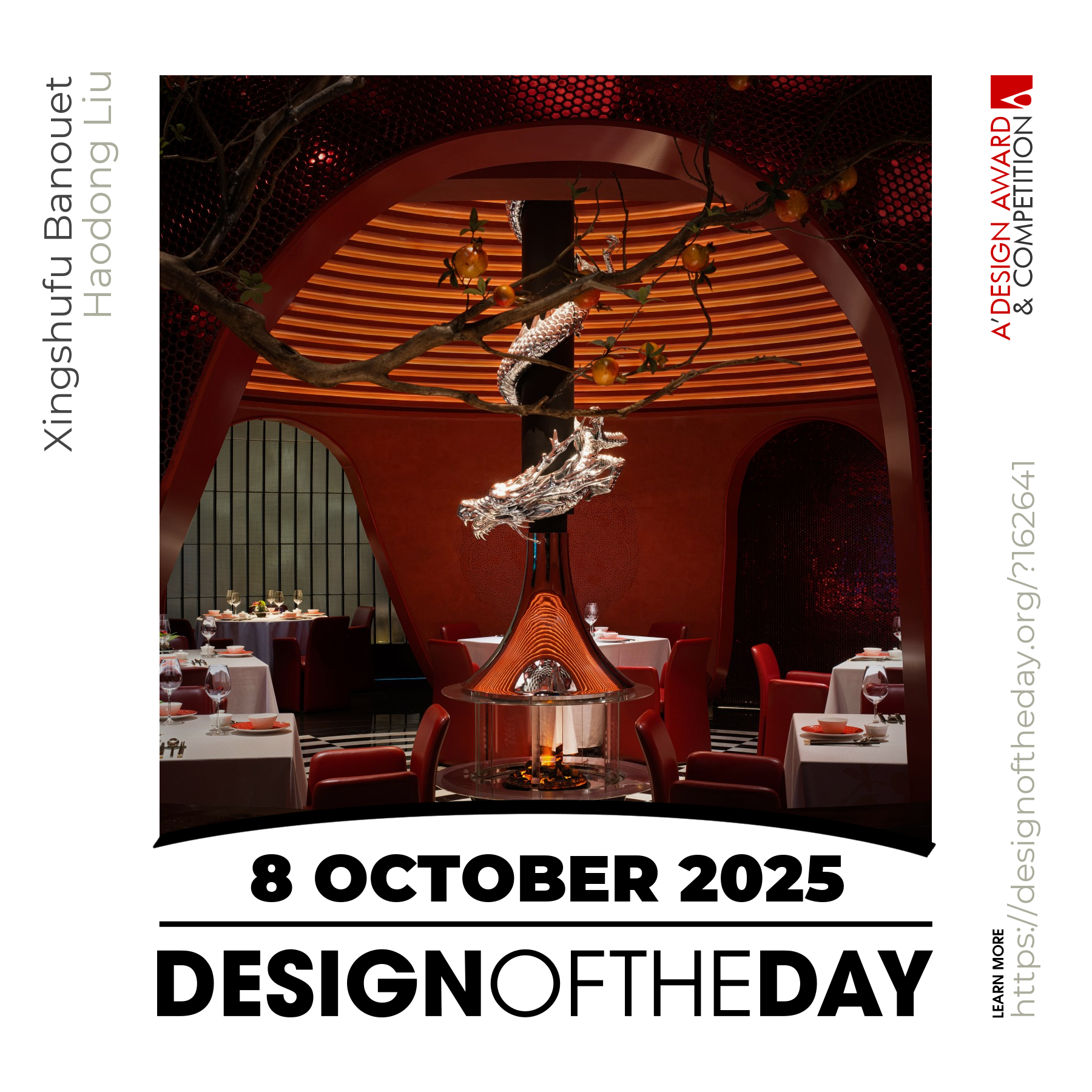
Good designs create value for society. Everyday we feature a special design project that demonstrates excellence in design. Today, we are pleased to showcase an award-winning design that makes a positive difference. We will be featuring more great and inspiring designs daily. Make sure to visit us everyday to enjoy new good design products and projects from greatest designers worldwide.

Continue reading