Packaging Design News

Packaging Design News

Packaging Design News featuring great design, architecture, fashion, graphics and innovation from across the globe.


Yep

Yep uses products with beauty and content to convey the attitude of sweet life and cool work to young and energetic people and fashionable and cutting-edge women with attitudes. The shape of the outer box is a triangle, which means the stability and powerful power of the product and consumer women. The pink and elastic logo conveys the touch of youthful vitality and seeks the balance between trust and fashion.

Continue reading


1821 Vintage Bolgrad

The Bolgrad brand embodies the essence of the southern regions of the Ukrainian coast: light atmosphere, great climate and good winemaking. The year 1821, which is indicated on the label and is its centerpiece, is the year the city of Bolgrad, located in the Odessa region in the south of the country, was founded. Bolgrad is the first Ukrainian producer who decided to bring to the market a sparkling wine in a lower and wider bottle, which is more typical of western producers. The design of this product reflects progressiveness, high status and adherence to European traditions of winemaking.

Continue reading


Spicy Shrimp Soybean Sauce

Different from other shrimp pastes with strong and prominent colors in the market, the packaging adopts the expression of primitive nature and Back to Basics. The outer packaging mainly uses a calligraphy shrimp character as an expression. The inner jar label is also a simple line drawing. The whole package does not contain non-degradable plastic, it can reduce the harm to rivers and soil and help to reduce the pollution of people’s food. Awakens people's awareness of environmental protection.

Continue reading


Pepsi Football

Pepsi celebrated the NFL in Mexico with a limited time offer can series that harnesses the power of the game. The approach dramatices the athletic power of the players and celebrates four NFL teams. The visual language heroes illustration within a design that showcases the passion of the national football league. The design reflects the strength and endurance of players and the pure emotion that keeps fans engaged in all game season.

Continue reading


Yamamotoyama

Yamamotoyama is one of the oldest and most established tea merchants in Japan. It has been the first to sell Green tea today. With the concept of Return to the origin of Edo, Nosigner have redesigned the packages to keep the traditional tea culture alive and pass it on to the future. To make them modern while retaining the charm of the long history brand, Nosigner referred to the traditional colors and structure of the scrolls with Yamamotoyama's original small crests and the calligraphy style of Edo.

Continue reading


Green Field Watchmen

The packaging design for this series of ecological rice is also rooted in profound strategic insights. With the rapid development of the Chinese economy, consumers in China prioritize safety and taste when purchasing rice. Noticing that ecological rice brands mainly emphasize safety without recognizing the greater value of deliciousness, the team named the brand Green Field Watchmen. The team emphasizes the sales proposition that ecological rice is more delicious, reflected in the creation of this series.

Continue reading


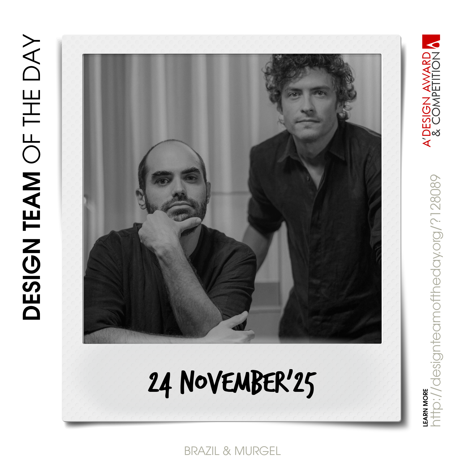
World's greatest design teams.

Sometimes you need a very big team of talented designers to come up with truly great designs. Everyday, we feature a distinct award-winning innovative and creative design team. Explore and discover original and creative architecture, good design, fashion, graphics design and design strategy projects from design teams worldwide. Get inspired by the original works by grand master designers.

Continue reading