Miok Milk Beer Packaging - Packaging Design News

Packaging Design News

Packaging Design News featuring great design, architecture, fashion, graphics and innovation from across the globe.


Miok

The brand identity design and packaging design for Miok is adventurous, creative, and joyful. The concept of Miok's brand identity is "Mixing", which represents the mix of milk and beer. Around the floating Miok letters, two liquid shapes are mixing into a new shape. The visual means to be bold, dynamic, and joyful to represent the beverage’s unique characteristics. The logo is the main visual element on product packaging, to make this new brand eye-catching and memorable in the market.

Continue reading
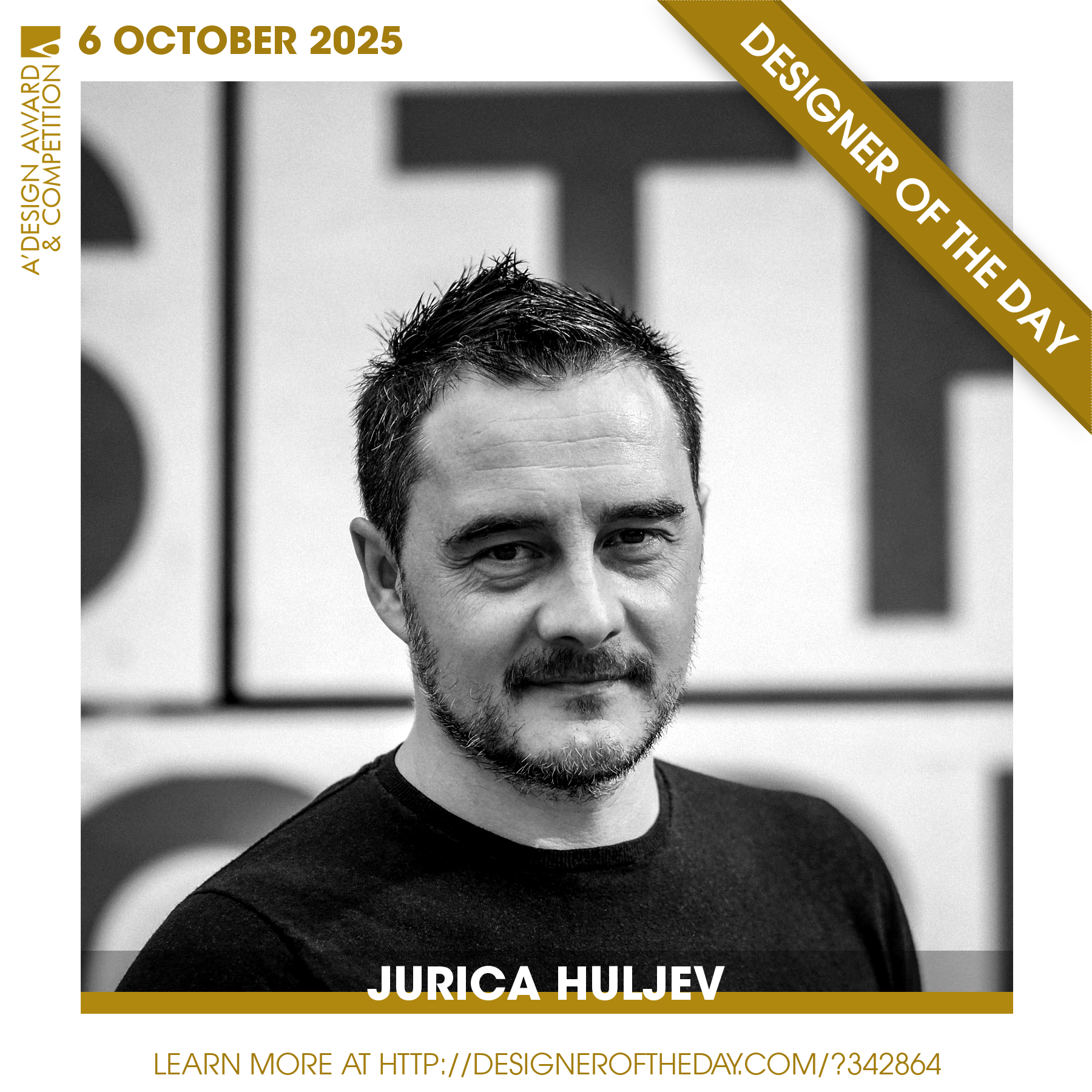
 

World's best designers, artists and architects.

Good design deserves great recognition. Everyday, we are pleased to feature amazing designers who create original and innovative designs, amazing architecture, stylish fashion and creative graphics. Today, we are presenting you one of the World’s greatest designers. Checkout an award-winning design portfolio today and get your daily design inspiration.

Continue reading